
Our partners at Stacks are digital creatives, librarians, and content management experts who are passionate about making digital asset management easy and approachable. To share a diverse set of expert opinions, we’re swapping and sharing insights and best practices to help you and your creative team work more efficiently, effectively, and impactfully.
Identifying key performance indicators and metrics, creating data reports, and analyzing data to develop actionable insights and optimized tactics are all integral steps of effectively managing and maintaining any strategy.
But, as most marketers know, not all measurements are equal or have the same “weight”. The world is full of “vanity” metrics—numbers that look great on paper but offer little to no actionable information or meaning.
Just like a good coach who wants to get the most out of their players and practices, you must identify metrics that provide real value to your organization.
These data points are often called key performance indicators (KPIs) and they should track directly to a measurable business or team goal. KPIs are different in each industry and situation, so identifying and tracking them effectively will revolutionize the way you manage, operationalize, and expand the use of your powerful digital asset management (DAM) system.
Related Stories: How to Increase Your DAM’s ROI: Maximizing Your Brand’s Content Library
Identifying and Measuring Key Performance Indicators
So, how do you differentiate key performance indicators from ‘vanity metrics‘?
To start, look at your organization or team’s goals for using your DAM platform. These goals should be measurable and time-sensitive, with clear parameters for success.
Ask yourself: What statistics or numbers will easily determine if our team or organization is actively using the platform? What activity markers will help us identify problems users might be having or vice versa, what would be a marker of success?
Another important factor to consider when identifying KPIs is that although your chosen data points align with the goals and help diagnose problems if you can’t visualize the data through a customizable report, it won’t be useful.
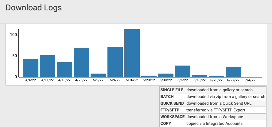
For instance, data dashboards like the Download Log (available to all PhotoShelter for Brands users) allows managers to see who is using their asset library and how in real-time. This enables them to provide their creative teams with more storage, integrations, or add-ons that make their workflows easier.
Pro Tip: To make visualizing success easier in a data report, set a target or range for each KPI that defines its success. If your metric lands in that range, highlight it in green!
Related Stories: 7 DAM Experts Share What They Wish They Knew
How to Develop Key Performance Indicators
Suppose your business goal is to cut the length of your organization’s sales cycle in half by the end of June – if your sales team usually closes in 90 days, your goal becomes signing on all new prospects as clients in 45 days or less.
First, you’ll need to know the average time clients spend in the sales cycle to determine whether or not you are on track, diagnose problems, and communicate actionable insights to your team.
The best way to find out this information is to ask your Sales Development Representative Manager. However, you can also leverage the tools you already have at your disposal—like your company’s customer relationship management (CRM) system.
If your CRM has reporting capabilities, explore the reporting features available to you and figure out how your team can develop reasonable, achievable key performance indicators for your sales cycle.
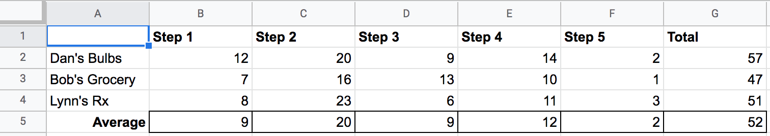
For example, let’s assume your CRM tool has data on the number of days that each of your clients is in each stage of your sales cycle. After accumulating the data for your last three clients, whether through a script or manually, your chart may look something like this:
By creating a graph, you can visually diagnose and see exactly where the team’s performance doesn’t meet the goal. If you include timeframe or dates, you can sometimes hypothesize and correlate performance against a calendar of your company’s activities or current events.
Here is a graph of the above data so you can compare it to the chart:
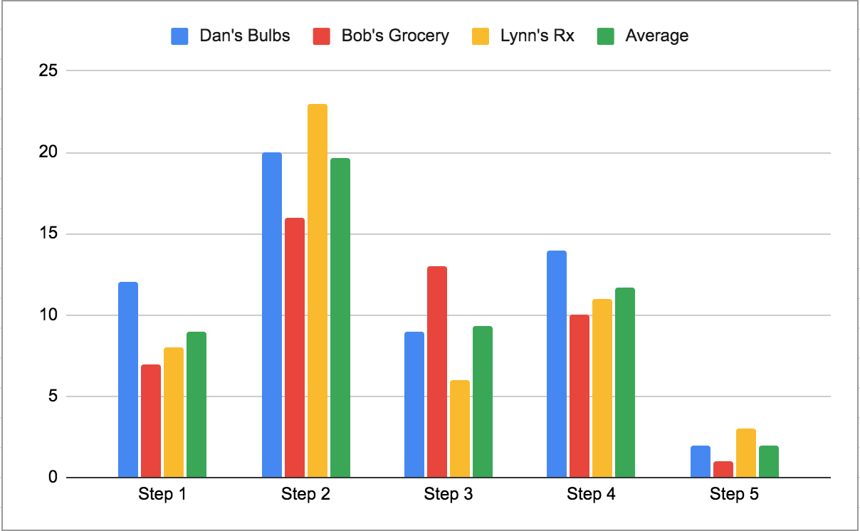
By analyzing the graph, your team can quickly see that Step 2 in the sales process is the best place to start shortening the sales cycle. Knowing that, you can ask how different team members are approaching that step to learn what successful tactics are being used, then you can optimize and improve your processes from there.
Once the data is easily digestible, decide how often you want to update and review it. Develop a schedule to consistently review your statistics and compare them to one another to ensure your goal is on track!
Related Stories: Tips for Measuring Success on Social Media
Not sure what KPIs could help you determine your team’s DAM success?